In Machine Learning, we always want to get insights into data: like getting familiar with the training samples or better understanding the label distribution. To do that, we visualize the data in many different ways. Typically, we need to look into multiple characteristics of the data simultaneously. In classic ML, for example, the data may have thousands of labels. To find the right model, we first need to understand the structure of the data and the importance of these characteristics.
In Deep Learning, the dimensionality gets higher compared to the classic ML. On the one hand, the datasets we work with typically don’t have many labels. In classification, for example, we only have an image and a single corresponding class label. On the other hand, Neural Nets have millions of parameters and multiple layers that do some complex data processing. To understand what’s going on inside the network, we may need to visualize the inner feature maps or parameter values — and thus again need to work with multidimensional data.
As we live in a 3-dimensional space, we can comprehend not more than 1-, 2- or 3-dimensional plots. To visualize multidimensional data in lower dimensions, there is a family of algorithms named Dimensionality Reduction methods. Today we’ll look into one of the most popular algorithms from this family named t-SNE.
t-SNE Methodology
t-SNE stands for t-Distributed Stochastic Neighbor Embedding. Laurens van der Maaten and the Godfather of Deep Learning, Geoffrey Hinton introduced it in 2008. The algorithm works well even for large datasets — and thus became an industry standard in Machine Learning. Now people apply it in various ML tasks including bioinformatics, cancer detection and disease diagnosis, natural language processing, and various areas in Deep Learning image recognition.
The main goal of t-SNE is to project multi-dimensional points to 2- or 3-dimensional plots so that if two points were close in the initial high-dimensional space, they stay close in the resulting projection. If the points were far from each other, they should stay far in the target low-dimensional space too.
To do that, t-SNE first creates a probability distribution that captures these mutual distance relationships between the points in the initial high-dimensional space. After this, the algorithm tries to create a low-dimensional space that has similar relations between the points.
It’s essentially an optimization problem — and the algorithm uses Stochastic Gradient Descent to solve it. As a cost function, it uses Kullback–Leibler divergence — a commonly used measure of how different two data distributions are.
You can play with t-SNE visualizations for various data distributions here. Note that t-SNE is a stochastic method (thus “S” in its name) which means that we can get different results in different runs of the algorithm.
To make the experiment reproducible, we’ll first fix all the random seeds just like recommended in this post:
seed = 10
random.seed(seed)
torch.manual_seed(seed)
np.random.seed(seed)
We will apply t-SNE to the features extracted by ResNet101 network. First, let’s discuss how Neural Nets process the data.
ResNet Features
We can describe the classification network on a high level as follows. They have a backbone that extracts valuable information, or features, from the image. It also has a classifier applied right after the backbone. The classifier makes a final decision based on the information extracted by the backbone.

During the forward pass, the backbone gradually decreases the spatial size of the data while increasing the number of its channels. This way, it extracts high-level concepts about the image contents — like notions of face or car — and stores them in the channels of the smaller feature maps.
In ResNet, the backbone uses a square image of 224×224 pixels in size with 3 channels as input. Its last layer produces a feature map of 1×1 pixel size only, but with 2048 channels. These 2048 floating point numbers are essentially all the knowledge and concepts that the network extracted from the input image encoded in some way.
This high-level information then goes to the classifier that makes the final prediction. ResNet101 has a high classification quality — which means that the information it extracts is rich and valuable. In fact, ResNet101 works great on the ImageNet dataset it was trained on, but it also works well on other datasets, too, which means that it can extract these concepts on many different types of images.
In this post, we’ll look into this network knowledge data. We’ll run the network inference up to the layer right before the classifier layer. This way, we’ll get the 2048-dimensional feature for every input image. After this, we’ll apply t-SNE to these features and will analyze the results.
ResNet101 without the Final Classifier
We need to re-implement ResNet to be able to extract the last feature map before the classifier head. To do that, we’ll create a class that inherits the standard torchvision ResNet and runs the inference without the final classifier. It’s important that this way we are able to load the ImageNet pre-trained weights to the network.
# Define the architecture by modifying resnet.
# Original code is here http://tiny.cc/8zpmmz
class ResNet101(models.ResNet):
    def __init__(self, num_classes=1000, pretrained=True, **kwargs):
        # Start with the standard resnet101
        super().__init__(
            block=models.resnet.Bottleneck,
            layers=[3, 4, 23, 3],
            num_classes=num_classes,
            **kwargs
        )
        if pretrained:
            state_dict = load_state_dict_from_url(
                models.resnet.model_urls['resnet101'],
                progress=True
            )
            self.load_state_dict(state_dict)

    # Reimplementing forward pass.
    # Replacing the forward inference defined here
    # http://tiny.cc/23pmmz
    def _forward_impl(self, x):
        # Standard forward for resnet
        x = self.conv1(x)
        x = self.bn1(x)
        x = self.relu(x)
        x = self.maxpool(x)

        x = self.layer1(x)
        x = self.layer2(x)
        x = self.layer3(x)
        x = self.layer4(x)

        # Notice there is no forward pass through the original classifier.
        x = self.avgpool(x)
        x = torch.flatten(x, 1)

        return x
Animals10 Dataset
In this post, we use the Animals10 dataset. It contains pictures of 10 different animals: cat, dog, chicken, cow, horse, sheep, squirrel, elephant, butterfly, and spider. Let’s take a look at the images first:

We’ll use 500 images from this dataset to keep the t-SNE plot uncluttered.
Inference
Now we’ll run the standard inference of our model on the data and store the resulting features (2048 numbers) and the paths and labels of the corresponding images.
# initialize our implementation of ResNet
model = ResNet101(pretrained=True)
model.eval()

for batch in tqdm(dataloader, desc='Running the model inference'):
    images = batch['image'].to(device)
    labels += batch['label']
    image_paths += batch['image_path']

    output = model.forward(images)

    current_outputs = output.cpu().numpy()
    features = np.concatenate((outputs, current_outputs))
Our multi-dimensional features are ready — let’s visualize them using t-SNE!
Visualizing t-SNE
We’ll use the t-SNE implementation from sklearn library. In fact, it’s as simple to use as follows:
tsne = TSNE(n_components=2).fit_transform(features)
This is it — the result named tsne is the 2-dimensional projection of the 2048-dimensional features. n_components=2 means that we reduce the dimensions to two. Here we use the default values of all the other hyperparameters of t-SNE used in sklearn.
Okay, we got the t-SNE — now let’s visualize the results on a plot. First, we’ll normalize the points so they are in the [0: 1] range.
# scale and move the coordinates so they fit [0; 1] range
def scale_to_01_range(x):
    # compute the distribution range
    value_range = (np.max(x) - np.min(x))

    # move the distribution so that it starts from zero
    # by extracting the minimal value from all its values
    starts_from_zero = x - np.min(x)

    # make the distribution fit [0; 1] by dividing by its range
    return starts_from_zero / value_range

# extract x and y coordinates representing the positions of the images on T-SNE plot
tx = tsne[:, 0]
ty = tsne[:, 1]

tx = scale_to_01_range(tx)
ty = scale_to_01_range(ty)
Now let’s plot the 2D points, each in a color corresponding to its class label.
# initialize a matplotlib plot
fig = plt.figure()
ax = fig.add_subplot(111)

# for every class, we'll add a scatter plot separately
for label in colors_per_class:
    # find the samples of the current class in the data
    indices = [i for i, l in enumerate(labels) if l == label]

    # extract the coordinates of the points of this class only
    current_tx = np.take(tx, indices)
    current_ty = np.take(ty, indices)

    # convert the class color to matplotlib format
    color = np.array(colors_per_class[label], dtype=np.float) / 255

    # add a scatter plot with the corresponding color and label
    ax.scatter(current_tx, current_ty, c=color, label=label)

# build a legend using the labels we set previously
ax.legend(loc='best')

# finally, show the plot
plt.show()
The resulting plot looks like this:
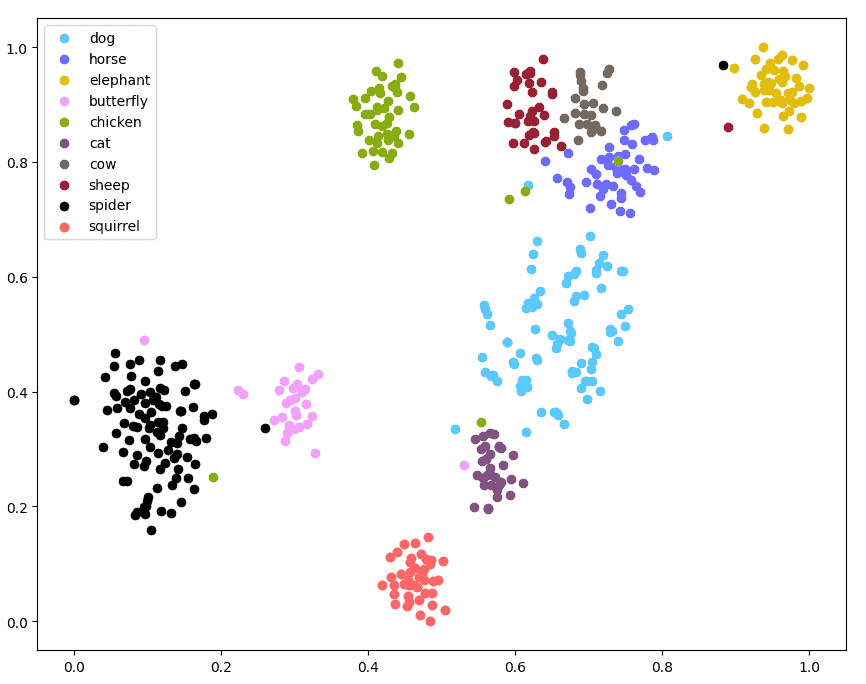
First, the samples of the same classes form clearly visible clusters here. This means that the network really understands the data and its classes and is able to distinguish them.
Second, notice the relations between the clusters here. We can see clusters of big domestic animals — cows, horses, and sheep — close to each other. Dogs are not far from them, and also close to the cat’s cluster. Spiders and butterflies are also located close to each other.
This means that the features represent semantic relations between the objects in real life. For example, ResNet101 “knows” the notions of domestic animals and insects. Indeed, this form of insight requires a deep knowledge of the objects, and also our world and culture.
Interestingly, we didn’t train the network on this type of knowledge directly. We only showed images and labels like “cow” or “horse” and not giving any information on how they are related. While training for the challenging ImageNet classification task, the network detected the relationship between the labels in an unsupervised way — and thus domestic animals form a cluster in its feature representations.
t-SNE visualization with images
Now we better understand how ResNet101 sees the objects — thanks to t-SNE visualizations. Let’s go a bit deeper and visualize the same plot but with every point replaced with a corresponding image instead. This way we’ll also be able to analyze relationships between specific images, not only the clusters as a whole.
Essentially, we’ll create an OpenCV Mat and will put a smaller version of every image at its corresponding coordinate. We’ll also draw a border around every such image colored in its corresponding class color. Let’s take a look at the code and pay attention to the comments.
# Compute the coordinates of the image on the plot
def compute_plot_coordinates(image, x, y, image_centers_area_size, offset):
    image_height, image_width, _ = image.shape

    # compute the image center coordinates on the plot
    center_x = int(image_centers_area_size * x) + offset

    # in matplotlib, the y axis is directed upward
    # to have the same here, we need to mirror the y coordinate
    center_y = int(image_centers_area_size * (1 - y)) + offset

    # knowing the image center,
    # compute the coordinates of the top left and bottom right corner
    tl_x = center_x - int(image_width / 2)
    tl_y = center_y - int(image_height / 2)

    br_x = tl_x + image_width
    br_y = tl_y + image_height

    return tl_x, tl_y, br_x, br_y

# we'll put the image centers in the central area of the plot
# and use offsets to make sure the images fit the plot

# init the plot as white canvas
tsne_plot = 255 * np.ones((plot_size, plot_size, 3), np.uint8)

# now we'll put a small copy of every image to its corresponding T-SNE coordinate
for image_path, label, x, y in tqdm(
        zip(images, labels, tx, ty),
        desc='Building the T-SNE plot',
        total=len(images)
):
    image = cv2.imread(image_path)

    # scale the image to put it to the plot
    image = scale_image(image, max_image_size)

    # draw a rectangle with a color corresponding to the image class
    image = draw_rectangle_by_class(image, label)

    # compute the coordinates of the image on the scaled plot visualization
    tl_x, tl_y, br_x, br_y = compute_plot_coordinates(image, x, y, image_centers_area_size, offset)

    # put the image to its t-SNE coordinates using numpy sub-array indices
    tsne_plot[tl_y:br_y, tl_x:br_x, :] = image

cv2.imshow('t-SNE', tsne_plot)
cv2.waitKey()
Here is what the result looks like:
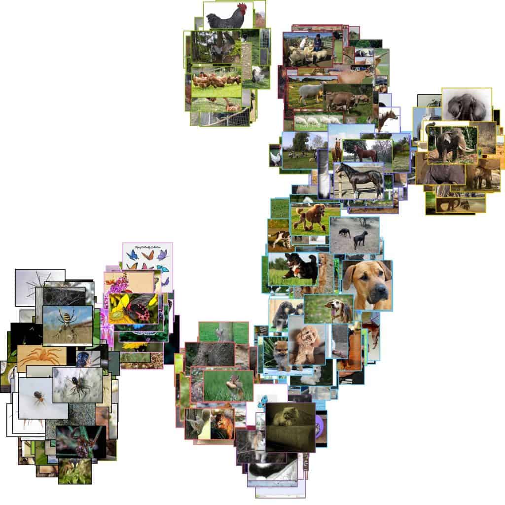
This visualization gives more insight into how the network “sees” the images. It places similar images close to each other — sometimes even similar images from different datasets. For example, take a look at the region with domestic animals.
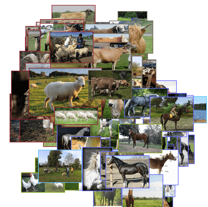
We see clusters of animals with similar colors: brown, beige, and white. Notice that the white horses are not far from the white sheep. Beige sheep are close to beige cows. The network located the animals in semantically meaningful clusters not only by their class and habitat but also by their color.
There is another article that uses TensorBoard for t-SNE. It explains the difference between PCA and t-SNE and how to use t-SNE effectively.
Summary
In this post, we used a popular dimensionality reduction method to get an insight into how the Neural Nets comprehend the data. It turns out that ResNet can cluster images of various animals into meaningful groups by their class, habitat, and color. This shows us how much the network knows about the world we live in — and probably gives us new ideas on how to use the network knowledge in cool real-life applications!


